How to create an aged, crusty-looking comic cover.
El Torres writes:
“Which resources do you use to give the ‘old scratched comic page’ feeling to a page? I mean, like ‘Heroes’ 9th wonders webpage, or that cool Invasion fonts ad?
I tried to do it scanning an old comic book page, erase the artwork in Photoshop, cutting and using the scratches as layers. But I lose a lot of “definition” in these scratches. No way.
I’ll appreciate any help. Thanks!”
You figured out the first step! I did exactly that — scanned an old comic cover that had as much white space as possible, then cloned the art out. Size it to match your artwork (or vice versa).
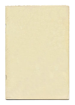
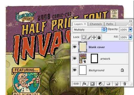
Copy and paste that image over your artwork, and set the blending method to “multiply”.
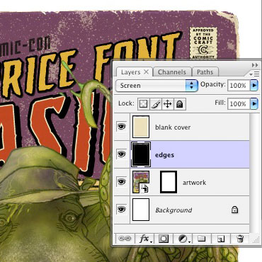
Then I scanned an old paperback book with a cover that’s mostly black, to get the crinkles and edges. Erase the artwork areas, then copy and paste it over the art (but under the blank cover).
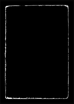
Set that layer to “Screen” and then scale it to fit the cover.
For the finishing touch, add some halftone dots!
Create a new layer (also below the blank cover), fill it with white, and (re)set your foreground/background colors to black and white (or hit the d key). Then choose Filter > Sketch > Halftone pattern. Set the size pretty low (usually between 1 and 3, depending on the size/resolution of your art), the contrast near the middle, and hit OK.
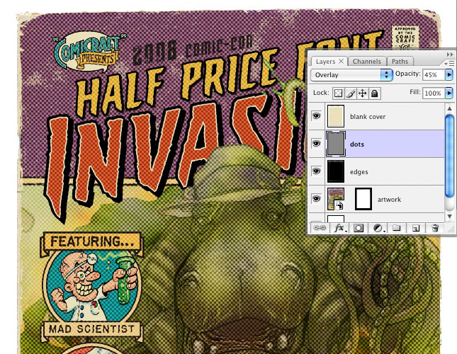
Set that layer to “Overlay” and slide the Opacity around to get just the right intensity of dots.
It always feels a bit silly to use thousands of dollars of technology to make something look old, cheap and low-tech, but there you go!
