<%INIT>
my $title = "Tutorial: How to Letter Comics the Comicraft Way";
my $description = "Part 4 - Electronic Lettering Composition";
my $category = "articles";
my $date = "200111";
my $topic = "";
my $keywords = "";
<& ../../header.mas, title => $title, category => $category &>
<%$title %>
- Introduction
- Character Study
- Fighting Words
- Title Deeds
- Electronic Lettering Composition
- Hand Lettering
| |
 Publisher sends SCRIPT and PLACE MENTS to Comicraft via e-mail, Fax or Federal Express; Low Resolution SCANS of the Artwork
arrive via e-mail or are transferred over the internet via FTP. Publisher sends SCRIPT and PLACE MENTS to Comicraft via e-mail, Fax or Federal Express; Low Resolution SCANS of the Artwork
arrive via e-mail or are transferred over the internet via FTP.
 The pages are Lettered in Adobe Illustrator, and PDFs or PROOFS are e-mailed or faxed to the Editor. CORRECTIONS are called in to Comicraft and New Proofs are generated. The pages are Lettered in Adobe Illustrator, and PDFs or PROOFS are e-mailed or faxed to the Editor. CORRECTIONS are called in to Comicraft and New Proofs are generated.
 Comicraft 's Lettering Files are coverted to EPS format and e-mailed or FTPedto the Publisher. They are then placed together with the Color Files in QuarkXPress and sent for output as FILM SEPARATIONS. Comicraft 's Lettering Files are coverted to EPS format and e-mailed or FTPedto the Publisher. They are then placed together with the Color Files in QuarkXPress and sent for output as FILM SEPARATIONS.
|

 hether you're working with a pen or a mouse, the rudiments of comic book lettering remain the same; your goal as a letterer is the same as that of the rest of the creators on the book:
You must help to tell the story.
 oremost in your mind should be the flow of the story from balloon to balloon, panel to panel and page to page. We read pages from top to bottom and from left to right. anytime copy fights against this learned inclination (in japan, comics are read from top to bottom and from right to left) you risk losing the reader's attention completely.
Your secondary concern in terms of your balloon placement should be to complement the dynamics of the art. A picture tells a thousand words, and those pictures will fall silent if you carelessly cover not only those artwork elements which readers need to see, but also, as any Danger Girl fan will tell you, the ones they want to see.
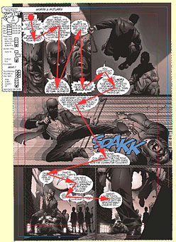
You don't need to know the inner workings of a computer in order to become a good letterer any more than you need to know the inner workings of a car in order to become a good driver. Nevertheless, you will need to study good lettering, in comics and other media, and spend time refining your craft. you'll also need to read a few software manuals; when you gain a thorough knowledge of Illustrator and a basic grasp of Photoshop and QuarkXPress you'll be able to create pages like the one shown here.
 ll said and done, carefully created lettering fonts, electronically composed on the artwork at the color separation stage, not only saves everyone in the comic book production process time, but can also guarantee a level of finesse and polish which pen-and-ink lettering cannot. Most readers will not notice the difference, and those that do will probably agree that the lettering looks cleaner and sharper. However, only if you're working on your craft will they note that it looks a little better... That much will never change.
Next: Hand Lettering
<& ../../footer.mas, topic => $topic &>