Episode 2 covers importing text into your Procreate document, and setting the point size and leading of your font (or pen lettering) using the 3-1 RULE.
Lettering in Procreate #1 – page setup & loading fonts
Doc John “JG” Roshell of Comicraft & Swell Type has locked himself in his Secret Underground Font Laboratory to deliver the Lettering Secrets of Everyone’s Favorite Tablet Drawing App, PROCREATE!
This first episode covers setting up a page and loading fonts.
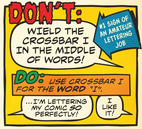
Why the Crossbar I Rule?
“Hello, I was wondering if you could explain why it’s necessary to crossbar the I only when it is used for the pronoun I (and sometimes for acronyms as well, also sometimes for names,?). I follow the comic book industry’s (apparent) standard preached by both Comicraft and Blambot, but when I contacted Blambot I was simply told ‘Show them any comic book from Marvel, DC or Dark Horse. That’s how it’s done.’ Could you provide me with, in your own words, an ACTUAL reason other than ‘because others do it’?”
Thanks,
Manda
Manda —
A fair question! As far as we understand it, the reason TO use crossbar I comes from back in the lousy-printing-on-newsprint days, when a single-stroke I could disappear, or be confused with an exclamation point. So it wasn’t necessary (and would take two more time-consuming strokes) in the middle of words. Sixty to seventy years later, it’s a tradition, and so to most comic readers, it looks weird and awkward to see the crossbar I in the wrong place. In the digital age, it’s considered the obvious mark of a letterer typing in all caps, who either doesn’t know much about comics, or isn’t paying close attention to their work.
The use of crossbar I for acronyms or names is a topic of contentious debate in lettering circles. 🙂 We at Comicraft choose not to, but some letterers do, and we think it’s fine, as long as it’s a deliberate choice and is applied consistently throughout the story.
The ultimate goal of lettering is that it become invisible, so the reader can get lost in the story. If a crossbar I (or any decision you make as a letterer) breaks that spell and pulls them out of the story, then it’s bad. But there’s a million ways to letter a comic — just be conscious of your choices, and establish them consistently, so your reader can learn them, forget about them, and let the story come alive.
We hope that helps!
— John & Rich
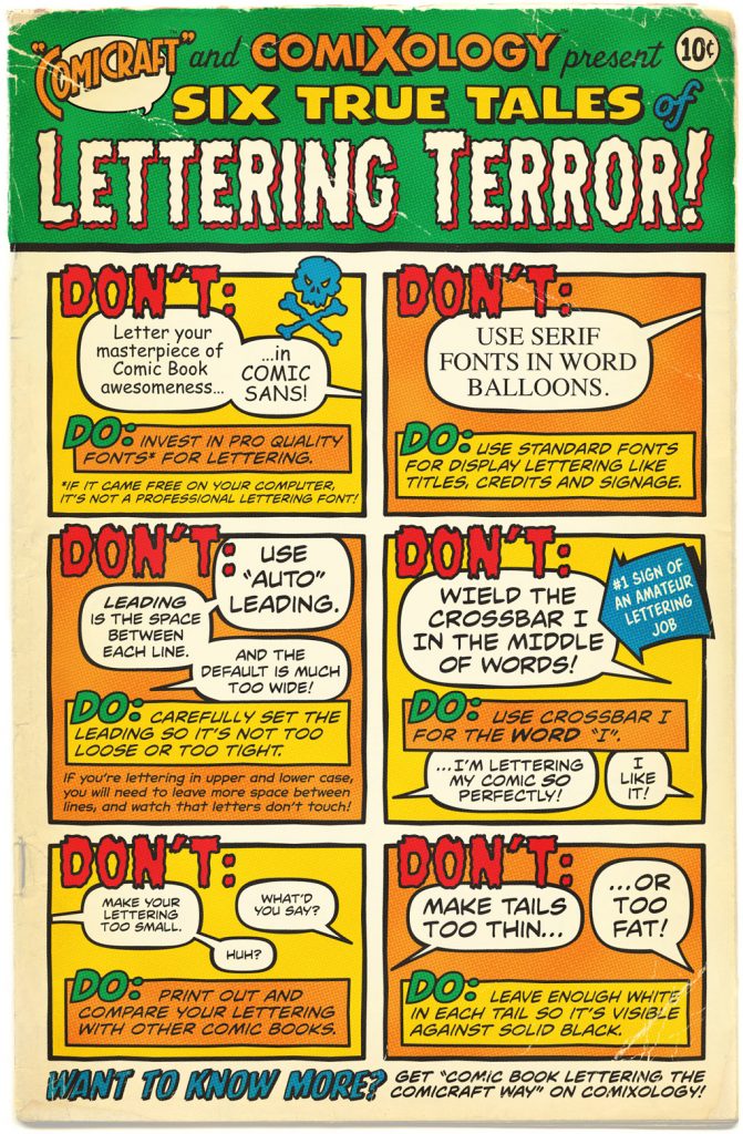
Lettering Dos and Don’ts for Comixology
True Tales of Lettering Terror! A page of Do’s and Don’ts created for ComiXology Submit.
Seven Uses for Thought Balloons
Reader Micah Wright responded to our Thoughts on Thought Balloons roundtable with a great analysis of the many uses of thought balloons from a single page of 1960s Spider-Man! We thought you’d enjoy it too.
Creating Thought Balloons
How to create thought balloons in Illustrator.
![]()
Opentype Ligatures
How to enable custom ligatures that automatically substitute any two letters in a row, or disable them if you prefer.
![]()
Gradients in Illustrator
How to fill objects with gradient fills.
![]()
Bouncy Text
Here’s a technique that works great for indicating baby talk, singing, drunkenness or any other time you want text to appear warbly, bouncy or sing-songy.

Continue reading “Bouncy Text”
Rough Balloons
How to create rough, wiggly-looking balloons in Illustrator.
![]()
