An interview with Richard Starkings by Robert Piotrowski, originally published in Marvel Vision magazine, 1996

Richard Starkings is at the top of his craft. Armed with an impressive array of computer software, exceptional skill, and a studio of talented young assistants, his company name has become synonymous with quality. Comicraft is credited in most of the best-selling Marvel Comics on the market today, including UNCANNY X-MEN, FANTASTIC FOUR, and THE AMAZING SPIDER-MAN. Not bad for a guy who used to work out of his apartment.
So how did Richard found one of the most successful studios in the industry? What are the secrets to his success? How did a single computer program fizzle out his globe-trotting aspirations?
Listen up, ’cause this guy’s got the power to leave the entire Marvel Universe speechless. Literally.
Robert: First things first: what the heck is Comicraft?
Richard: The most common misconception is that Comicraft is a computer program that I use. But in fact, we’re a graphic design studio dedicated to comic books.
How many books is Comicraft credited in each month?
It varies from month to month. It can be anything from twenty-five to fifty different titles.
Wow! How do you manage that?
Well I don’t work alone you know! There are a dozen designers and “Comicraftsmen” working closely together under my direction. Using computer technology that duplicates my hand lettering style, we’re able to say yes to far more projects than I’d be able to handle by myself.

Tell me about your first job.
I came out of college with a degree in English Literature and found a job as a proofreader. I think being able to spell is one of the unstated qualifications for being a letterer so it was actually a good start.
Where did you work?
Ironically enough it was at the National Computing Center in England.
Were American comics and letterers even a factor for you then?
Growing up I was exposed to comic books such as EAGLE, TINTIN, ASTERIX and 2000AD, as well as a healthy dose of Marvel books. In Europe there’s a different attitude towards type and graphic design. When I started working in America, I brought that style with me whether I liked it or not.
Were you an established lettering talent before moving to the U.S.?
Yes, but I was an editor and designer at Marvel UK for five years before I decided to give my attention to lettering full time. When I moved to the States in ’89 I was basically just doing books to get by. I wanted to travel across America and, hopefully, around the world. I had a ’round-the-world ticket and I was going to kick back for a year. But that didn’t work out.
What happened?
When I moved from New York to California, I learned the graphic design programs on the Macintosh. Then I learned how to digitize my lettering style. I knew that I needed to be able to turn books around overnight if I wanted to make the grade as a letterer. This seemed to be the way to do it.
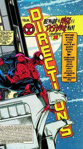
Did that lead to the creation of Comicraft?
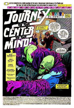
That’s where it started. In 1992 work at Marvel was plentiful because Image Comics had lured away quite a number of letterers. I made a habit of picking up the books that these people were leaving behind. By the time my first regular book, SLEEPWALKER, was drawing to a close, I was lettering it with my computer font. By this time I’d hired my first assistant, John Roshell. That was all when I was still working out of my apartment. Today, the Comicraft studio fills out over 750 square feet in downtown Santa Monica.
What type of limitations are there on the level of creative expression that can be incorporated in lettering and design as compared to writing or penciling?
I believe that you’re only limited by your imagination. It doesn’t matter if you’re working with a pencil, a computer, or a ten penny nail dipped in ink. If you have the talent and the imagination your tools can’t limit you.
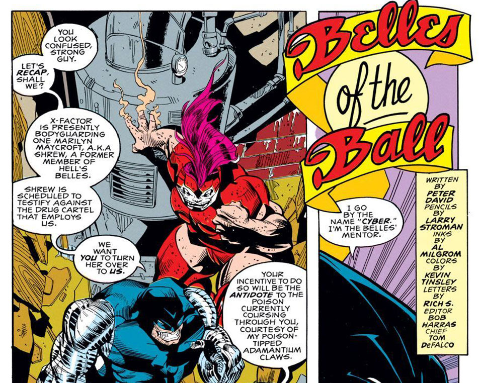
When is Comicraft work at its best?
When people don’t tell us what to do. It’s great when an editor or artist trusts us to do a good job. Perhaps, that’s why the X-office gets the most out of us. They leave us to do what we do best.
Is there some type of bible for figuring out how to spell all those sound effects or do you just sit around making the sounds in slow motion and try to spell them out afterwards?
Most writers will spell out the sound effects they want on a particular page. But nine out of ten will use too many letters so we usually trim them down.
Okay, if Wolverine was hit by a freight train, a charging Juggernaut and a 1000-pound anvil while Onslaught, the Beyonder, Phoenix, and Galactus let loose in his general direction, what sound would that make?

A very very very big…
How was your penmanship when you were a kid?
I spent most of my time at school designing logos for the names of the particular classes I was sitting through. I was always fascinated by letters. I would rarely draw pictures. I preferred to write down a word and try to make it look interesting instead.
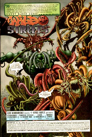
What is the inspiration for all of the different designs that Comicraft is responsible for?
Instead of just looking at other comics to see what other letterers have done, I encourage everyone in the studio to look outside of comics. I look at type styles on matchbooks, bottle labels, movie posters… all sorts of type and graphics. When you bring something out of one medium into another, you create something new. I think that’s what makes Comicraft a little different, a little special.
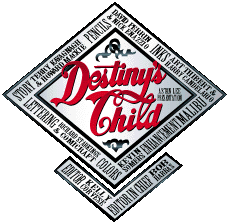
Where does Richard Starkings get his inspiration from personally?
Friends. Family. I was particularly affected by some words of wisdom shared with me by a Buddhist chap by the name of David Kasahara in New York. He told me that a dishwasher in a restaurant can choose to be totally unhappy with his lot because basically he’s just cleaning up dirty plates. Or he can take it upon himself to make the plates and glasses shine so brightly that the customers come back to the restaurant just because the crockery is so clean! I really took those words to heart. Generally, you don’t pick up a comic book and rave about the lettering any more than you would sit in a restaurant and say: “Wow! These knives and forks are shiny!” But you can’t properly appreciate a meal if your plate isn’t clean, can you?
So even when I was working out of my apartment I decided that I would make the lettering look so good that readers would regard it as an important part of the artwork. At Comicraft, we try to complement the art and seek to embellish it only when it’s appropriate.
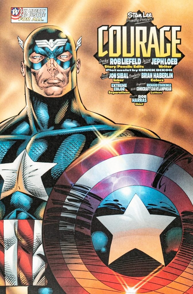
Do you ever get frustrated because your work is often overlooked in favor of the artists working on the books?
No. The important thing is that the people we work with love what we do. Talents like Jeph Loeb, Scott Lobdell, Howard Mackie and Dan Jurgens actually go out of their way to make sure that we’re involved in their projects because they know what we’re capable of doing. That’s the highest compliment.
Chris Bachalo has been a particular blessing to Comicraft. We rarely talk to one another but he always leaves us plenty of space to do what we do best.
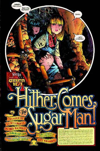
Is that why there is so much great Comicraft stuff in GENERATION X?
GENERATION X is probably our flagship title. I knew it was going to be a special book because of the creative team working on it so we decided to go out of our way to make that book look really neat.
During the Age of Apocalypse storyline, Bob Harras noticed that we were giving our all to the books. Shortly after, he pretty much gave us all the X-titles. Until that point we were perceived as the computer guys. GENERATION X earned us a lot of respect.
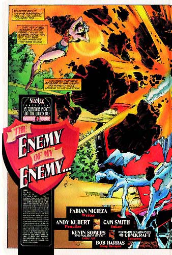
To the untrained eye a lot of lettering may look the same. What is it that makes Comicraft’s style unique?
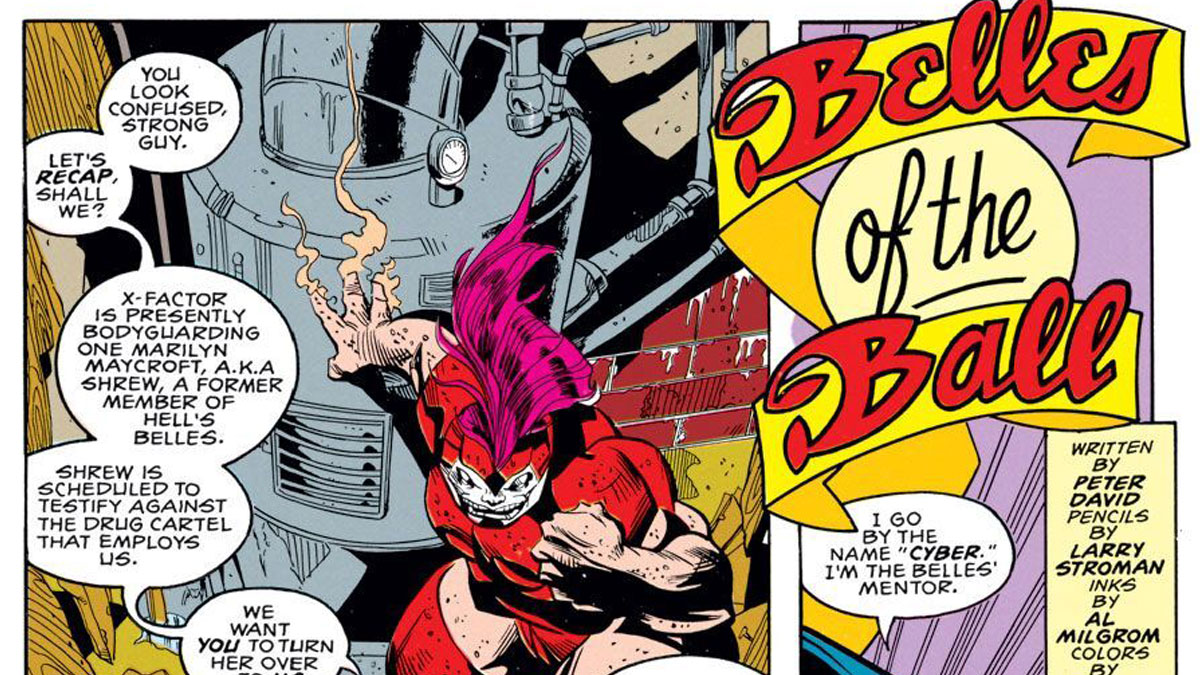
We spend a lot of time finding ways to give each of our books a distinctive look. However, when all is said and done, the real strength of the work we do is in our placement. That’s the most important element in any letterer’s work. If you can’t develop a clear lettering style and an understanding of how to place balloons, then forget it.
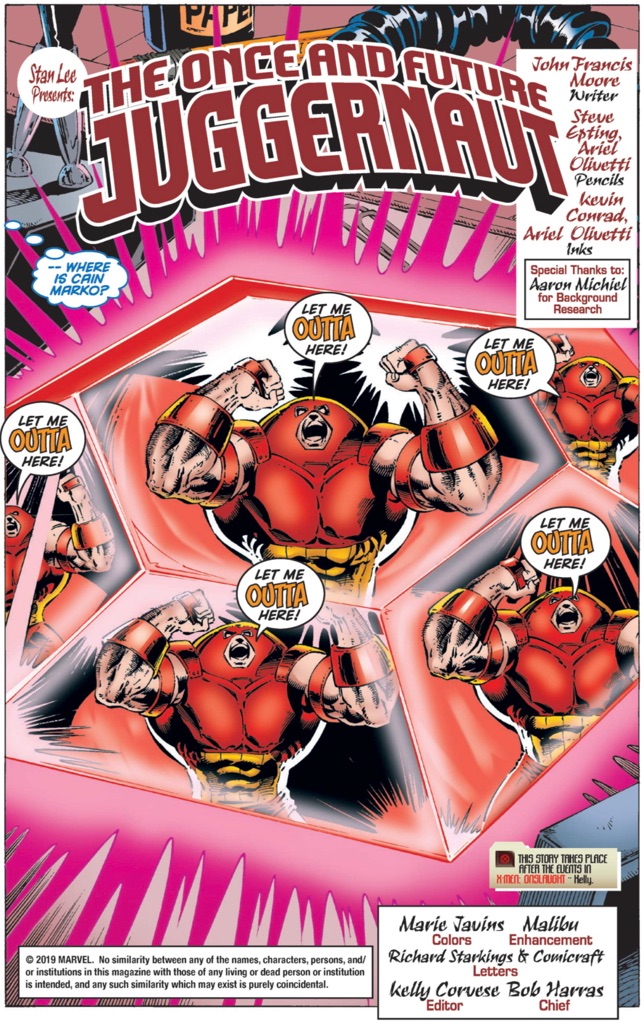
What’s the coolest effect that you guys can do?
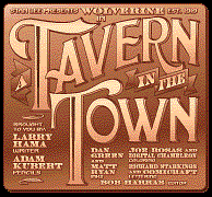
I think we really set a standard for ourselves with the title page of Generation Next #2. X-Men #45 and X-Men Unlimited #12 were goodies too. Title pages are always a lot of fun. That’s where the letterer gets an opportunity to really polish the dishes! It’s the place where the artist says, “Here’s some space for the title, don’t screw up the page!”
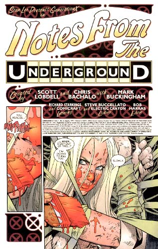
Are you still able to sit down and enjoy reading comics or do you find yourself just looking at the design effects and going, “we should’ve done that way better?”
Sometimes, but just recently I was checking over our printouts of X-Men Unlimited #12. I got so caught up in the story that I forgot I was supposed to be proofreading it!
Where would you like Comicraft to be ten years from now?
That’s tough because typically you don’t think beyond this week’s deadline. I’m really not sure, to be honest. Can you give me a deadline? I’ll get back to you.
