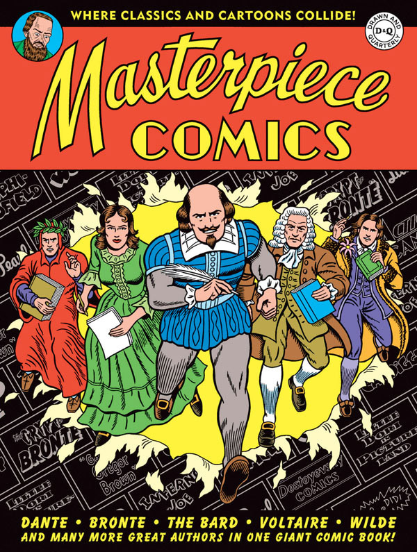
You’ve probably seen one of R. Sikoryak’s vintage comic parodies on The Onion, Nickelodeon Magazine, The Daily Show or on the cover of The New Yorker or Fortune — and thought at first glance, like I did, that it was the real thing! Drawn & Quarterly has just released “Masterpiece Comics”, a 64-page hardcover collection of Sikoryak’s “classic literary works reimagined as classic comics,” so it seemed like the perfect time to contact the mysterious R. and find out exactly how he creates his fantastic illustrations, and what role lettering and fonts play in the process.
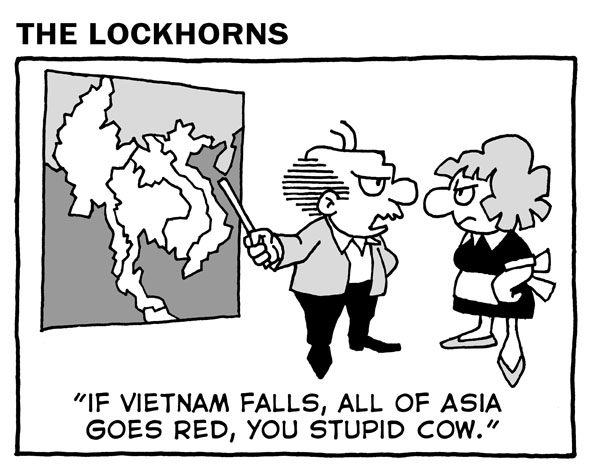
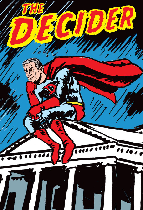
John: The first time I saw your work was these dead-on “Lockhorns” and “The Decider” strips for The Daily Show. How did that gig come about, and what’s it like working with them?
RS: I was asked to draw a few comics parodies for The Daily Show’s America (the Book): A Citizen’s Guide to Democracy Inaction. Most of my previous work was done for magazines and books. From there I was hired to do some cartoons and illustrations for the show.
All the writing is done by the staff, of course, and many of them are big comics fans, so they always get the details right. They’re a real pleasure to work for. The deadlines are sometimes overnight, so the pressure is on, especially when they’ve needed a dozen drawings in 24 hours! But as you can imagine, it’s extremely thrilling to see your work on TV after a whirlwind drawing session.
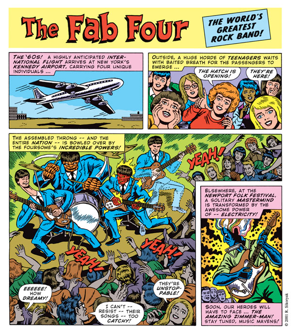
John: You do a remarkable job capturing the look and feel of vintage comic art. Do you draw on the computer, or with pen and ink like the original artists?
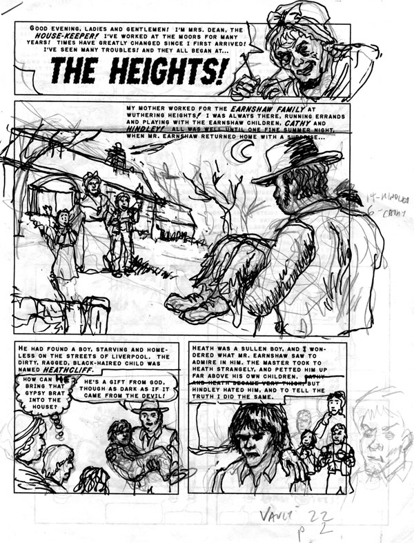
RS: I generally start with doodles in my sketch book. I’ll break down the story very loosely with thumbnail drawings, then begin laying out the text and panel boxes with InDesign. Then I print out the inDesign pages on 8 1/2 x 11 inch paper, and sketch on those printouts or on tracing paper.
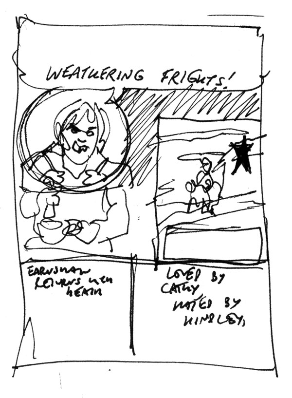
John: So the lettering is part of your page composition from the very beginning?
RS: Yes. I always want to know exactly how much space to reserve for the text before I go too far in planning the drawings for each panel. Even if I’m hand lettering a strip, I’ll find (or create) a similar looking font and lay it out with InDesign, so I can determine the spacing I’ll need on the final art. This saves an enormous amount of time.
John: And which phantastically phenomenal fonts do you like to use for this process, hmm…?
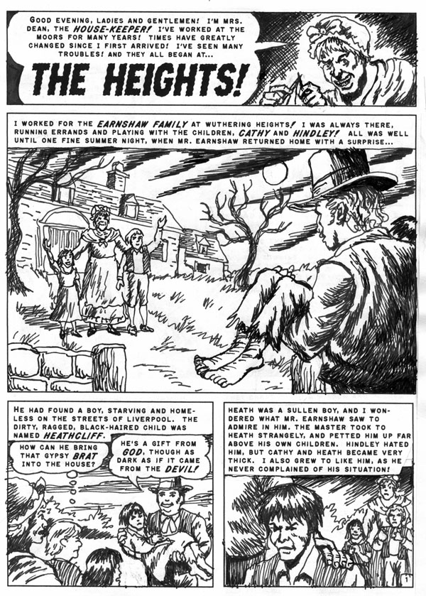
RS: A lot of my comics and illustrations use your fonts. The House-Keeper page has the “Rigor Mortis” font, and the back cover features “Chatterbox.”
John: Huzzah!
RS: But most of the “Masterpiece” book is either hand lettered or, in a few cases, uses fonts I had made based on specific lettering styles.
John: What?! Other fonts? PEN LETTERING?!? Sounds like I have some holes to fill in our catalog. Alright, so then what?
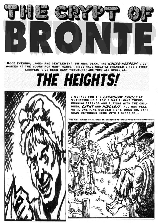
RS: When I’ve revised the sketches sufficiently, I’ll scan those, import the text from InDesign, and tweak them in Photoshop using my Wacom tablet. I might repeat this process of refining by hand and by computer several times.
John: So you combine the look of pen with the flexibility of the computer. On which side do you end up?
RS: I print out the Photoshopped sketches at approximately 10 x 15 inches, trace them in pencil on bristol board, and then ink with traditional brushes, pens, and ink. Because I often emulate cartoonists of the past, I try to use the same or similar tools as they would to create my finished art.
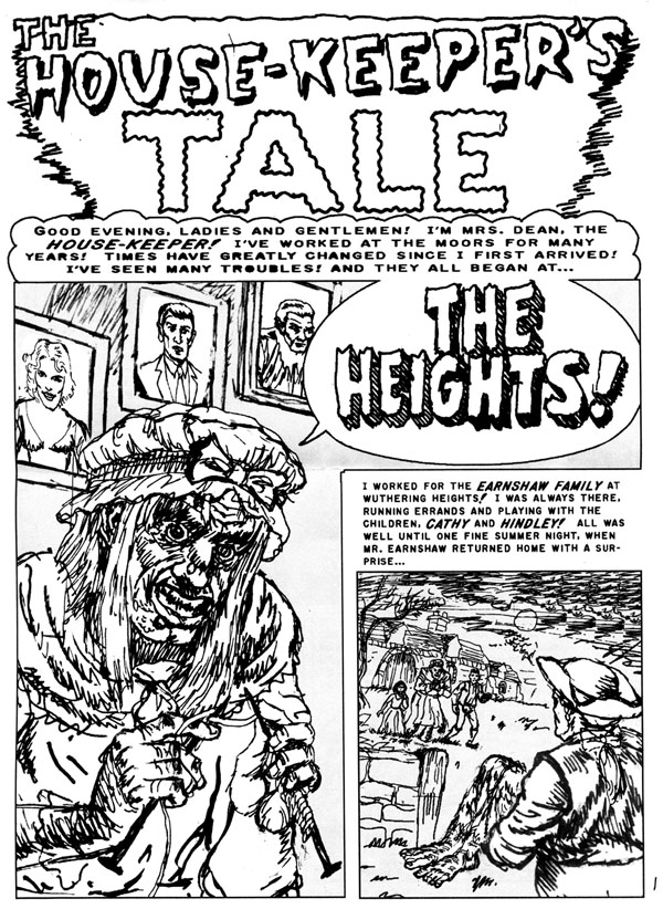
John: Is your final lettering done with fonts, or a combination of computer and pen as well?
RS: Sometimes I’ll paste the font on the original artwork. Other times I’ll trace a font for a more organic look. When I did my Little Nemo parody, it was vital that the lettering was somewhat wonky, to match Winsor McCay’s style. In that case I inked with a dip pen, as he did.
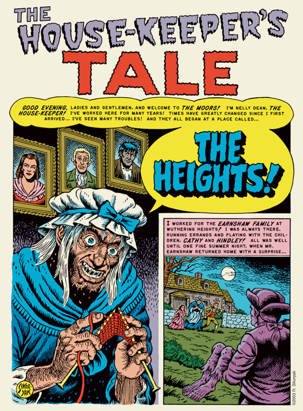
And when I need a specific word balloon font, such as for my parodies of the 1950s Batman or Little Lulu, I will draw a full alphabet with a rapidograph or another pen, then scan and tweak the letters in Photoshop.
John: How about sound effects and titles?
RS: I love hand lettering sound effects, logos, and story titles, so I generally draw those with rapidographs and dip pens. And if a logo or title is very elaborate, sometimes I’ll do an initial layout with a font like “BiffBamBoom”, print it out, and then trace and refine it with pencil and pen on bristol board.
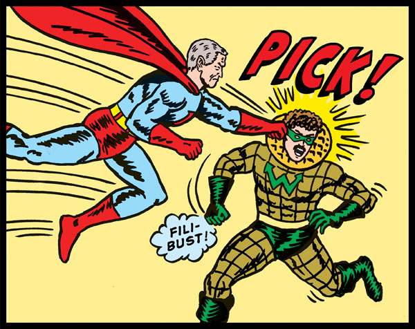
John: And what about color? Wait, let me guess — you paint with watercolors and cut the separations with rubylith?
RS: I actually used to use zipatone and rubylith! I worked at Raw magazine in the late ’80s and ’90s, and I learned the old fashioned techniques.
Now, of course, I scan my pages and color them in Photoshop, using a fairly limited palette to emulate old comic books.
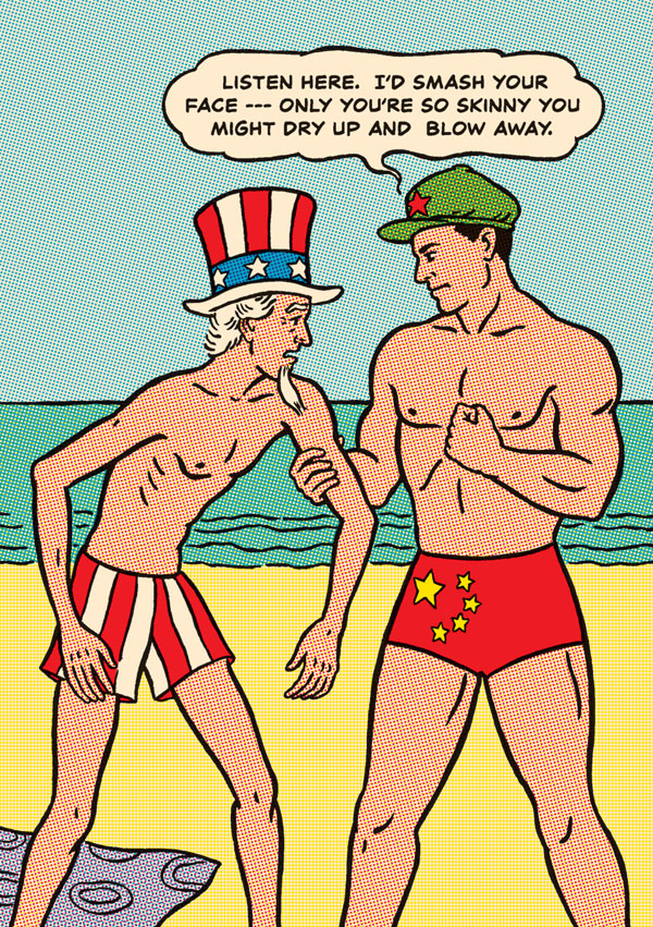
John: Wow, that’s quite a process. But the results are worth it — the book looks fantastic! Thanks for taking time to share your process with us.
RS: You’re very welcome!

“Masterpiece Comics” is a 64 page full color Hardcover from Drawn & Quarterly. Get yours at DrawnAndQuarterly.com or Amazon.com
See more of Sikoryak’s art at RSikoryak.com
