A discussion on Comic Lettering with Lee Nordling, Al Davison, Richard Starkings, Todd Klein, Kurt Busiek, Marv Wolfman, Michael T. Gilbert, Batton Lash, Bob Ingersoll, Bill Knapp, Malcolm Bourne, Steve Leialoha, Leonard Kirk, Howard Cruse, Steven Grant & Bryan Talbot.
This conversation took place online over the course of a week on the e-mail group Panel2Panel. I’m always keen to stimulate conversations like these — any comment that sparks a consideration of the importance of good lettering, created by a professional and thoughtful letterer, raises creator’s awareness of the role of the comic book letterer.
Many writers and artists say “Yeah, Yeah, lettering is important,” but if they don’t hear the arguments for and against, they can easily dismiss it or accept bad lettering as a matter of course.
— Richard
Lee Nordling: Most editors have no real appreciation for how good lettering and ballooning needs to be handled. Mark Evanier once told me that lettering will bring a book up OR down by 10%, and I subscribe to this. Take a nicely illustrated book like 1602… the lettering and balloons pop out…and they shouldn’t. Most editors believe that if the lettering can be read then it’s done its job. Sigh.
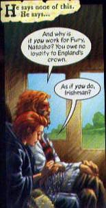
Al Davison: The lettering in 1602 is quite bold, and the balloons are either white or strong colors, that make them sit on top of the art rather than blend with it, the art by Andy Kubert is in pencil, with muted computer coloring. Some captions are done in a sort of ‘typewriter’ style font, that jars with the Elizabethan period. I think that at least some of this could have been improved in production, simply by making the balloons and captions slightly transparent, so they merged with the art a bit more. Klein’s a good letterer, but a bit more discussion on appropriate style, and a bit of thought from the production department would have helped.
Richard Starkings: We submitted a sample page for 1602 when we were still welcome at Marvel, and JG created styles which we thought were more than appropriate for the book — the captions made their way into Kurt’s ARROWSMITH book, so judge for yourselves — but Marvel currently has a “one font fits all” philosophy which can crush the spirits of letterers young and old and makes for a frustrating experience for any creators working on books at Marvel who would like to see different approaches to lettering on different books. What a concept.
The only exceptions to this rule that I’ve experienced are Tim Sale’s books — Tim told them he’d walk rather than see bland lower case lettering on his art — and JLA/AVENGERS, simply because Marvel can’t tell DC to letter their books in lower case, and opted for a look that would be consistent for both companies.
Very few editors and creators are happy with the lower case lettering that has been forced on them and when I spoke to Todd at San Diego it seemed to me that he wasn’t entirely happy with the style he was being asked to use on 1602.
Todd Klein: Lee and Al — sorry you don’t care for the look of the lettering on 1602. I understand your point on the balloons popping out from the art, and I did address that problem, though perhaps not well enough for you. If you look closely, you will see that that word balloons are filled with an off-white tone, except where they fall over a pure white area. This is very hard to detect, but the balloon borders are not the usual 100% black, but are a compound of all 4 colors, to help them blend better with the art. The captions are filled with a parchment-like pattern, no border, though with a compound-black drop shadow. All this is in response to the issue of standard balloons contrasting too much with the “painted” art.
As for the caption type style, it’s not a typewriter font, it’s one I created from a printer’s sample sheet of fonts designed by William Caslon in the late 1600s, printed on hand-made paper, that I bought in Williamsburg, VA’s colonial-era print shop. A bit later than the period of the comic, but I felt close enough. True Elizabethan-era type is actually much harder to read today due to the fact that they used characters we no longer see in our printed matter, such as the f-shaped “s” and its compounds. The idea of making the balloons slightly transparent is not one that is possible using the production methods currently in place at Marvel, but even if it were, I don’t think I’d want to do that. I’ve used the effect twice in PROMETHEA for a particular look over a few pages, but I find it distracting, personally, and annoying when used on a whole book. My eyes keep focusing on the art beneath rather than reading the lettering. That may only be a personal quirk, though.
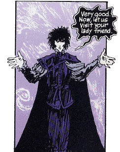
Neither Neil or I were happy with the Marvel edict that ALL books had to use upper and lower case, not because either of us dislike the style per se — it’s what the Sandman spoke in, after all — but because we don’t think blanket edicts are a good thing, and would have preferred the option of choosing whatever styles we thought were best for the book ourselves. That said, I think we’re both happy with the way things are looking now, and have had a chance to be creative within the constraints of the edict. Note that all the fonts used in 1602 are my own, rather than the ones being used on most other current Marvel books.
Rich: Todd, thanks for weighing in. I haven’t seen either book but I figured you were working your best within the Marvel framework. I think it’s a shame Neil didn’t stare them down on 1602 as Tim Sale has done.
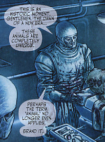
I used transparent balloons on HIP FLASK but switched to solid for the hardcover and I think I prefer the solids now. It IS possible to create transparencies for Marvel — we looked into it for SPIDER-MAN: QUALITY OF LIFE at the editor’s request — if they were able to upgrade to Illustrator 10.
Lee: I pulled them out again, and have looked closely, and I do see that he’s added a tint. I thought it was the paper color…
Well, Todd did everything I suggested he do… without me even realizing he’d done it. Four color on the balloons, so they blend with the art; check. Tinting behind the lettering, so the white paper doesn’t pop so badly; check — though more tint would’ve helped significantly… but I’m not the writer, artist, letterer or editor on this, so it’s just a vote from the cheap seats.
And I know what it’s like to get so close to something that you can’t see whether you’ve completely accomplished your goal or not… and perhaps Todd is entirely happy with his work here… so I won’t belabor my earlier thoughts about the look and word placement within the balloons. I do appreciate having this discussion about the lettering on a specific book, though. It’s been educational and collegial.
Rich: I’m all in favor of lower case lettering as an option—we letter SAM & TWITCH, WALLACE & GROMIT and my own strip, HEDGE BACKWARDS, in lower case. But there’s a big difference between TINTIN and JLA/AVENGERS or WHEN THE WIND BLOWS and SUPERMAN. My feeling is that as children we gravitate from the educational, lower case alphabet which filled all those baby books we learn to read at school to the more exciting and urgent upper case lettering found in comic books, which grown ups found difficult to read because everyone was shouting. The fact that grown ups find comics hard to read or understand is, I think, part of the appeal to a child.
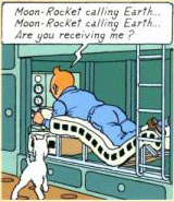
The cleaner and gentler lower case lettering in TINTIN or WHEN THE WIND BLOWS—or EIGHTBALL—is appealing to a more sophisticated reader who can see past the idea that lower case lettering is for kid
s, and frightens off the less mature readers who want their dialogue in short, sharp urgent upper case lettering that grown ups don’t understand.
I think that Marvel’s lower case lettering mandate is an admission that their readership is growing older, and that they are intentionally making their books less appealing to a younger readership. I think the number of characters declaring their civilian identities is another aspect of the same intention—”I’m Steve Rogers and I’m Captain America and I don’t talk in no freakin’ upper case any more… I’m comfortable with my life fighting crime and I favor lower case lettering — it’s sensitive and exotic.”
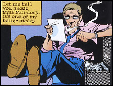
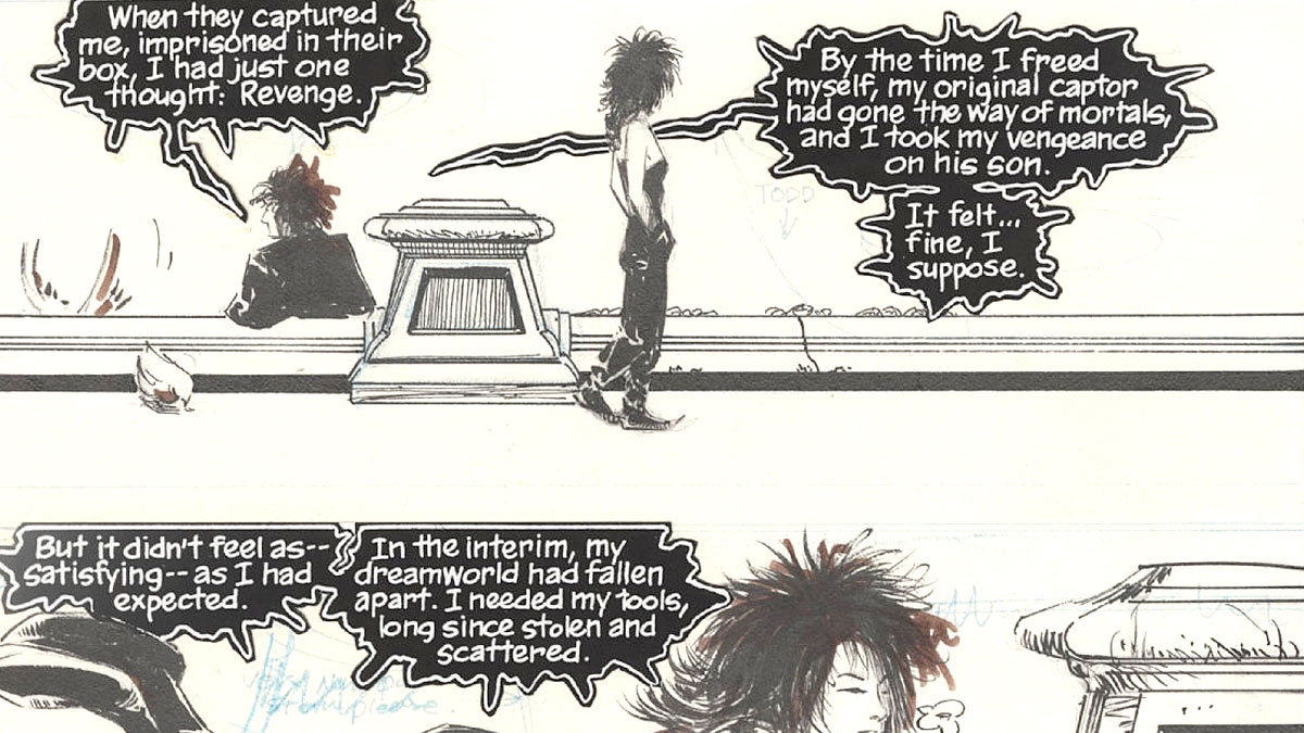
However, whether they’re called THE AVENGERS or THE ULTIMATES, they’re still a bunch of grown men running around in their pyjamas, the kind of characters that are more likely to appeal to children/young teenagers than grown ups. Lower case lettering won’t change that, but it will limit the range of styles and subtle distinctions available to a writer and the letterer with whom he is working. Ben Urich’s captions in Miller’s DAREDEVIL lose part of their uniqueness in a book that is lettered predominantly in lower case. Ditto Dream’s lower case balloons in SANDMAN, ditto Baby Grumpling’s balloons in THE PERISHERS, ditto Yap of Gatecrasher’s Technet in EXCALIBUR. I’m not a big fan of a lot of characters speaking in different styles and distinctive balloons or captions styles, but I think it’s a mistake to limit the options — can you imagine one font throughout Eisner’s SPIRIT? Or POGO? Or CEREBUS? Or, the Byrne/Claremont/Orzechowski X-MEN, or Chaykin/Bruzenak’s AMERICAN FLAGG?
Lower case lettering throughout a comic book would’ve been unthinkable before the advent of digital lettering (yeah, blame me) because it’s just waaay too difficult to letter quickly and efficiently in lower case at the size necessary. Counters would fill with ink, ascenders and descenders would cross each other and the text would need to be much bigger on the page, covering more art. One of the possibilities presented by computer lettering that editors and publishers abuse is the idea that you can make lettering smaller very easily. But just because you can, doesn’t mean you should. How many times have you picked up a CD or DVD in the last ten years and squinted to read the text on the packaging which someone has set in 4pt — not realizing that it will be illegible because it’s easy to read on the computer screen at 400%?
Batton Lash: Well said, Rich! Lettering should fit the style — and mood — of a strip. Frankly, I see the upper/lower edict less an artistic decision and more of a business move — giving Marvel’s books a different look from their competitors. Of course, a company “look” is fine, but for every Richard Starkings and Todd Klein who are conscientious, there are too many grunts using lettering fonts as typesetting, rather than utilizing lettering as part of the words and pictures/comics page chemistry.
The upper/lower edict is just more of the throw-the-baby-out-with-the-bathwater thinking that has bedeviled the comics business for years. What’s next, a sanction on exclamation points and other forms of punctuation??!!
Bob Ingersoll: I think another part of the business decision is that by insisting on one uniform font in Marvel books, they can bring lettering in-house and utilise people who know how to type but not kern. Lettering can then be done cheaper, just not better.
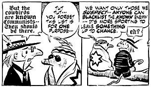
Lee: Stylistically, upper and lower case present many interesting opportunities, one being that you can change the “voice” of the strip without changing fonts… the latter being risky unless the letterer is enough in tune with how fonts complement each other. Best examples I can think of here are Walt Kelly on POGO, and Todd Klein on PROMETHEA. Most people can’t do this well, and the lettering disrupts the book more than anything. I just saw another example recently, where upper & lower case was used at the beginning of an upper case sentence — I think with the word, “ahem” — and the effect was that the upper and lower case felt like a whisper or a clearing of the throat.
I haven’t been fond of smaller type for whispers… as a lot of lettering is pretty small as it is… and while it’s interesting to have type so small that you can barely read it be visually similar to a spoken whisper that you can barely hear, I find it disruptive to the flow of the storytelling.
So… for use within a sentence of upper case lettering, this is another way upper and lower case could work.
Michael T. Gilbert: Bob Powell did a teen book (I think for Tower) in the mid 60s. One of the characters was a big bashful football jock, and Powell had all his lettering very small, as if he were too shy to talk louder. Very simple and very effective!
Lee: I’m sure it was, but I’d bet dollars to donuts the “normal sized” lettering in the rest of the book was pretty large. With so much dialogue-heavy text in comics these days, the lettering is already pretty small. Also…I’m starting to join that group of people who have to wear reading glasses — an annoying enough development as it is — so making small type even smaller for the whispers really is quite disruptive.
Michael : Of course. It was the contrast between the large lettering of the rest of the comic that made the small lettering so effective. And “contrast” is the baby Marvel’s thrown out with the bathwater in their quest for lettering uniformity. I think it’s a big mistake.
Kurt Busiek: I agree that lettering should fit the style of a strip. There have been times in the past when I wanted to do a strip in upper & lower case, but wasn’t allowed because there weren’t letterers available who could do it well, but I don’t like doing most superhero books that way, because it doesn’t strike the right tone. Leonard Starr’s ANNIE was gentle and calm — it worked beautifully in upper & lower case. But IRON MAN doesn’t.
There WAS a sanction on exclamation points and other forms of punctuation a long time ago, but it didn’t last. In the Shooter years at Marvel, he wanted as few bold words, exclamation points and double-dashes as possible, because he thought it looked “comic-booky.” He also wanted all word balloons in the upper or lower corners if possible, regardless of how far away from the speaker that made them, because he thought formularizing it made it easier to read. Less dramatic, though.
What he didn’t realize is that conventions evolve for a reason. The overabundance of exclamation points may have started because periods tended to vanish in bad printing, but it also reflects the fact that in superhero comics, these guys are urgent all the time. So sure, once the printing is better, you don’t need an exclamation point on “Let me go get my hat!” but it sure helps on “Great Scott — that’s Galactus.”
And bold words aren’t just there to indicate verbal stress — though that function makes them quite useful in a medium that has no surrounding text or tone of voice — but also to break up the balloons. A balloon of several lines of upper case lettering tends to blur into “gray” to the eye, but having bold words here fixes that, so the eye doesn’t skip or repeat lines, even if the reader isn’t consciously aware of why.
Shooter also banned thought balloons and sound effects at Valiant, on the same old “comic booky” grounds.
Over at Eclipse, Cat Yronwode also had lettering glitches—as I recall, she hated bold words, too, and words like >sigh< or >gasp<. She tried to replace them all with transliterations — HHHH or AHP or sounds like that. Again, on the grounds that it was “comic booky,” and she wanted her belov ed medium to be taken more seriously.
My reaction was generally that we were doing comic books, so we should use the strengths of comic books — we should do things that ARE comic-booky, because they’re the things we can do that other media can’t. Eliminating sound effects and thought balloons may be more cinematic, but since a comic isn’t a movie, you won’t fool anyone, but you’ll rob your work of a tool that can be used, when appropriate, to good effect.
And I argued with Cat many a time over this sort of thing, pointing out that (a) nobody in a novel says “hhhh.” There’ll be a sentence saying, “He sighed,” and “>sigh<” is simply the comic book equivalent of that. Readers won’t know what you mean by “hhhh.” And (b) if you’re so proud of comics, then celebrate them. Get people to take them seriously by doing them well, not by trying to make people think they’re prose or movies.
In the end, I wound up rewriting scripts to avoid use of that kind of thing at all — and then when THE WIZARD’S TALE moved to Wildstorm, I rescripted it and put a bunch of them back.
Oddly, Cat also really liked the convention of bracketing foreign dialogue — something I generally don’t like — and when I wrote a script that avoided it, using novelistic conventions to indicate when people were speaking different languages, she tried to get me to change it. And when I wouldn’t, she added in the brackets (in violation of my contract) before the book went off to press, using a ball-point pen and getting a significant proportion of them wrong.
Strange that they weren’t “comic booky” to her…
Batton: Yes, the comics medium should be embraced — “comic booky” look and all! For a while, it even seemed that the word “cartoonist” was too derogatory to use for someone who drew comic books (deliver us from the ’70’s!). I always found it puzzling that some editors– and even some pros– would dismiss bold lettering, exclamation points, sound effects and thought balloons as too juvenile, while working on the latest super hero slug fest. And don’t you think indicating cursing with @#$%! is more effective — and at the same time — less harsh, than the real thing? I knew things were getting back on track when I saw comic book artists once again using stars to indicate pain >sigh
Marv: Absolutely agree. We are becoming far too, I wanted to say sophisticated but that’s wrong — I think the word is ashamed of what we are and we’re trying to mimic movies, which we’re not. Only reason I didn’t use thought balloons in Dracula was to create mystery. I believe in moody captions, sound effects and everything else. It’s what defines comics as its own tool.
By the way, if you look at Manga, which is now far more popular than American comics, they use sound effects for everything, including a head turn. They also use thought balloons and captions. They’re not ashamed of what they are and instead embrace those conventions. I’ve felt for a while that we’ve been trying to be movies, right down to scene changes without caption explanations.
