An interview with Richard Starkings by design student David Velez
1. Can you give a general outline of how you got into your field?
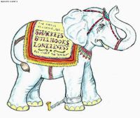
I read somewhere that, to make sure circus elephants never run away, the trainers ‘recruit’ elephants when they’re very young and chain them to posts, using chains which the young elephants can’t break. Of course, the elephants still try to break the chain when they’re first chained up, but to no avail. As these elephants grow, the trainers keep them tethered with the same chains, which the elephants have come to believe they cannot break; not realizing that, as full grown adults, one swift tug on the chain would snap it like a twig. So it was that my older brother — a part time comic book dealer — starting taking me to comic ‘marts’ in Liverpool and Manchester on occasional Saturdays during school holidays when I was still at the tender age of 10 years old. He paid me with comics (my best payday had to be the day he dropped the first 80 issues of 2000AD into my lap) and ensured my dedication to the industry of comic books from that moment on.
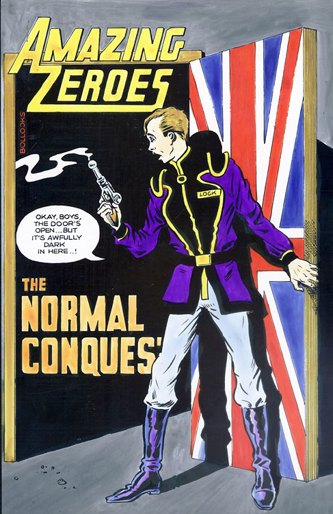
In my late teens and early twenties I created a number of cartoon strips for fanzines and college publications inspired by the work of Dennis Collins on a strip called ‘The Perishers.’ Collins was an incredible illustrator, storyteller and lettering artist, and at some point I realized that even if my cartooning wasn’t so good, my lettering skills were getting there. I offered my services to Harrier Comics, a small independent publisher of amateurish black and white comics in England that enjoyed a short run of success in the early eighties. Harrier offered no compensation and I asked for none — what they did provide me with was hands on experience and, furthermore, work that brought me into contact with a number of young, up-and-coming creators with whom I soon developed strong friendships and, later, professional associations.
I’d often meet up with Harrier’s editor, Martin Lock, at the Westminster Comic Mart in London, and then meet up with inker Dave Harwood and other Harrier creators in the pub, the Westminster Arms, next door. Practically the entire UK comics community gathered in The Westminster Arms every other month, it was a fantastic atmosphere, and circuitously helped me to land a staff job at Marvel Comics. In 1984, I had applied to Marvel editor Ian Rimmer for a job as art assistant, and met up with Ian — and a gaggle of wannabe comic strip writers and artists who’d dragged me along from the pub — in the café at the Westminster Mart. Ian had already interviewed me for the staff job and turned me down, but in the meantime he’d given me a break lettering strips like TRANSFORMERS and FREEFALL WARRIORS (for CAPTAIN BRITAIN), and after meeting with him at Westminster, he eventually relented and took me on staff. By this time, I was also lettering strips for 2000AD and continued to do so while working at Marvel.
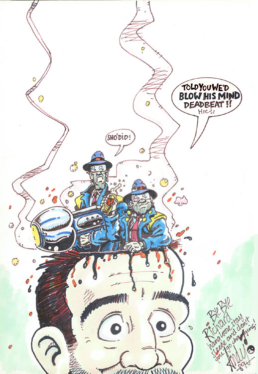
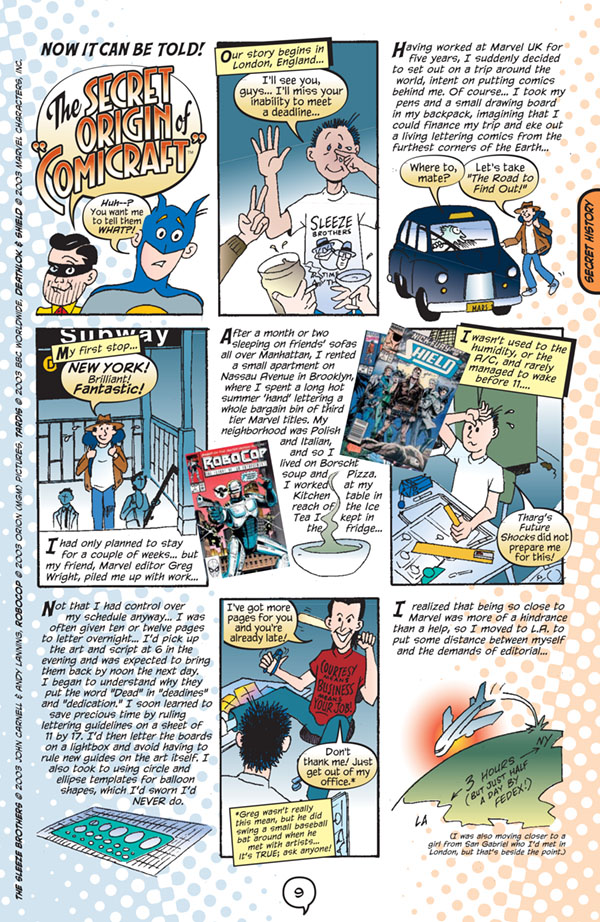
The Marvel UK offices were located right behind another pub known only as ‘The Redan’ in Bayswater off Queensway. Like The Westminster Arms, The Redan was also a great meeting place for freelance artists and writers, and a very convenient location for ‘story conferences.’ As a matter of fact, after I’d been working as a graphic designer at Marvel for a year or so, it was in The Redan that Marvel US editor-in-chief, Tom DeFalco suggested to me that my energies would be better spent working as an editor. Shortly thereafter I was given the job of editing Ian Rimmer’s scripts for ZOIDS. Ian was technically the editor AND writer of ZOIDS, and this was at a time when Shooter and DeFalco’s philosophy was very much “We don’t care WHO you are, every writer needs to be edited.” I don’t think Ian liked my editorial style very much because shortly after my ‘appointment’ Ian hired Grant Morrison to write ZOIDS on a regular basis and Ian went back to editing. Of course that didn’t stop me rewriting bits and pieces when I was ‘lettering’ the strip, and I was later given the responsibility of editing ACTION FORCE (GI JOE for Brits), THE REAL GHOSTBUSTERS and three comic books aimed at the US market — DRAGON’S CLAWS, DEATH’S HEAD and THE SLEEZE BROTHERS.
2. What kind (if any) of training do you have in the design/art field? And do you feel training and schooling is something that is needed in the field , including he comic industry?
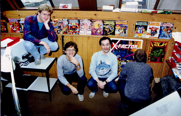
During the course of five years working at Marvel in London, I worked variously as a letterer, art assistant, colorist, color separator, editorial assistant, editor and finally group editor. Quite frankly, working at a comic book publisher is the best training available; I learned just about everything there was to learn about putting together a comic; experience which stood me in good stead when I moved to America in 1989 and went about the business of creating… a business. I have never really thought of myself as a lettering artist, although that is something that I can do, and I think I do it well, but it’s just one quality which I lend to the comic book production process that makes my involvement valuable.
That said, I spent three years at college, before I worked in comics, earning myself a degree in English & Media Studies — and I’m sure my experiences as a student were invaluable to my career in comics. I learned a lot about the business of telling stories at college and, though it’s difficult to measure the exact effect my studies have had on my work, I’m certain they were and are of very practical use to me. I was discouraged by my brother (the circus trainer, remember?) from studying art and graphic design, and I now regret taking heed of him. Training and schooling are exceptionally important for an artist, and sadly lacking in the comic book field.
3. What kind of resistance did you receive as you began lettering comics digitally?
Enormous. Bob Harras, editor of the X-Men books, once forbade me to use computer lettering fonts on ANY X-Men titles EVER.
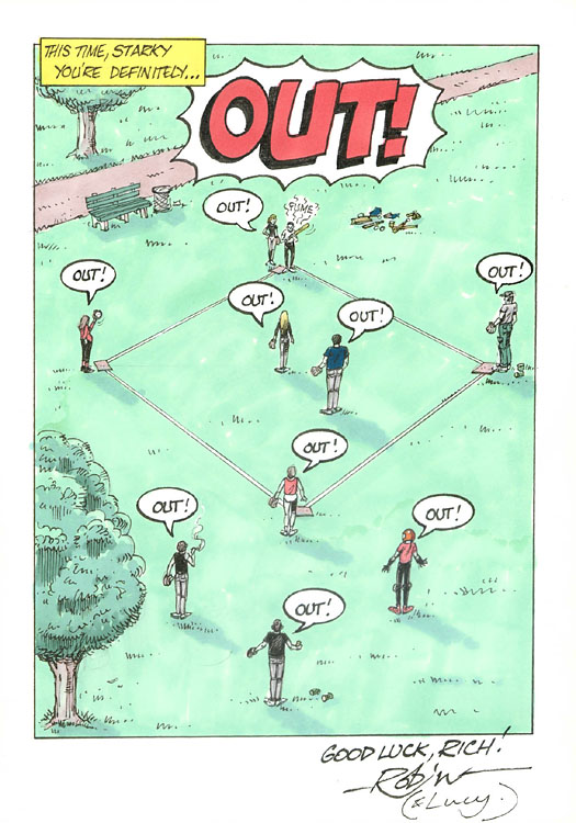
When I quit my job with Marvel UK and moved to New York, I worked for a while as a freelance lettering artist and I was surprised to note how much one American letterer’s work resembled another’s. I soon discovered that I was the only letterer working in the states with German technical pens. Most every letterer working for Marvel and DC worked with American ‘Speedball’ nibs and so right there and then my work was regarded as ‘different.’
It’s ironic, therefore, that when I first approached US publishers with the concept of ‘computer’ lettering that they were afraid to lose the ‘personality’ provided by hand letterers. Editors frequently encouraged letterers to ape one another’s styles so that they could split assignments up and still meet their print deadlines. Consequently, pen letterers in the States had already created amongst themselves a uniform style. Speed of execution was often the only element that distinguished one letterer’s style from another. If Rick Parker’s lettering was more italicized than Bill Oakley’s, you could be fairly sure that Parker was the faster of the two.
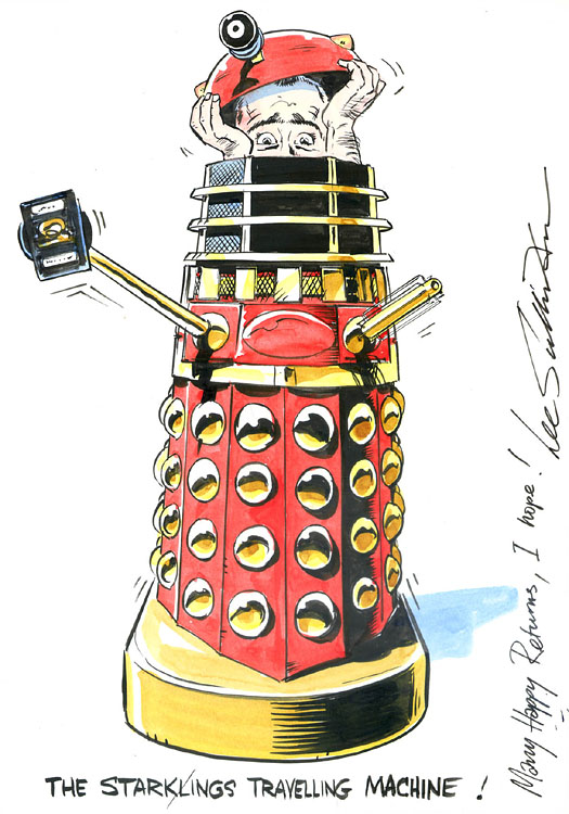
Nevertheless, I picked up a couple of regular monthly pen lettering assignments from Marvel and DC in 1989 and 1990 — a year or two before the speculator-driven Image comics boom. Working for Marvel editors in New York proved to be exhaustingÉ I was often tested with one-off twenty-two pages assignment which I was expected to pick up at around six at night and then return at 10am the following day. Even if you were capable of lettering a page every half an hour, you were lucky to get any sleep at all. Under these conditions, many of the more established and successful lettering artists created a studio system of their own, often hiring an assistant (or relative) to rule up lettering guidelines, rule panel borders (still re
garded by DC Comics as part of the letterer’s job) and ink balloon strokes and caption edges. I personally saved myself precious time by ruling up lettering guidelines on a sheet of paper and developed a system whereby I would letter pages on a lightbox, with the guidelines behind the board. I also bought half a dozen ellipses — circle & ellipse templates — which allowed me to create balloons more quickly and easily.
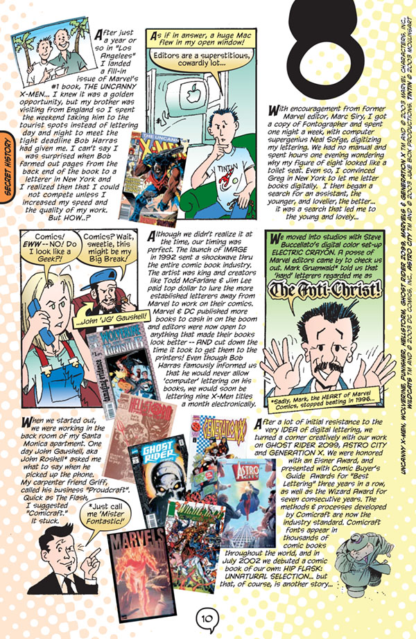
In no time at all… I realized to me that making a living this way while at the same time setting a high standard for myself were almost mutually exclusive goals. I found myself in a crucible one day when my brother came to visit me from England one weekend. By this time, I had moved to LA after seven months in New York. On the Friday prior to my brother’s visit visit, I was offered a fill in issue of UNCANNY X-MEN, widely regarded as the comic book letterer’s Holy Grail at the time, thanks to the incredibly creative work of ace lettering artist Tom Orzechowski. I knew I couldn’t say No, but I also knew I’d much rather spend time with my brother than work through the weekend. My reward for putting family ahead of Uncanny was the loss of half the book. It was at this moment that I realized I had to find a way of increasing my speed without sacrificing the quality of my work. At around this time I bumped into a former Marvel assistant editor and undiscovered supergenius, Marc Siry, who proposed to me that I digitize my lettering styles.
After a certain amount of trial and error, I produced a workable digital version of my pen lettering style and convinced a couple of editors at Marvel to let me letter their books electronically. I still needed to print out the lettering so it could be pasted up, but it got people accustomed to the idea of digital lettering and allowed me to hire an assistant, John “JG” Roshell, still working with Comicraft after eleven years, and very much my right hand man. JG and I created the methods and processes which are now the standard for comic book lettering throughout the industry, and either one of us created, or co-created the fonts which we’ve made available at comicbookfonts.com.
4. What is your exact role at this time in “Comicraft” and what is it you do day to day?
I describe myself as ‘President & First Tiger,’ titles which both describe and disguise my variousresponsibilities. I am effectively a publisher (of fonts and also my own comic book, HIP FLASK and a number of trade paperbacks my publishing company Active Images will be issuing later in the year), a graphic designer, a letterer, a writer, a cartoonist, a font designer, a personnel manager and often an uncredited editor and adviser. Consequently, I have no typical day… Today I created three or four title pages for various Marvel and DC books, cover lettering for two Superman books, coordinated the lettering for a new Danger Girl book — “Hawaiian Punch” — and contacted Tim Sale in regard to requests from a French publication for artwork (Active Images is putting together an Art of Tim Sale book, so I have all of Tim’s sketchbooks here). I also bugged artist Chris Bachalo to see if he’s made a start on a special HIP FLASK story he’s doing for us and I processed three orders for fonts, as well as an order for two HIP t-shirts. Tomorrow I need to spend time working on a French edition of HIP FLASK, and at some point this week I’ll need to letter Wildcats and take a look at a book we’re lettering on spec for Tokyopop — an LA-based publisher of manga which is interested in Comicraft’s services.
5. What do you look for when hiring designers and artists?
Enthusiasm, a sense of space on the page and the willingness to learn.
6. Where do you see the comic industry as a whole in the next 5 to 10 years?
The comic industry is evolving and becoming gradually closer to the European and Japanese models. The most interesting new comic book right now is Shonen Jump — manga in English for American kids. My seven year old had little interest in comics until this one came along, but he’s responded to it the way I responded to Spider-man thirty years ago. Children love comics, but only if those comics are as full of energy and excitement as they are. As long as the industry produces comics for children it will have a future. But it’s important to remember that Marvel and DC are not the be-all and end-all of the industry — I include newspaper strips, hundreds of children’s books and comics from other countries as important sources of innovation and advancement for comics “as a whole” as you say. Superhero comics are a ghetto, but when people talk about the ‘industry’ they usually mean superhero comics.
7. Where do you see the design industry as a whole in the next 5 to 10 years?
That’s a question that’s too big to answer. I suspect you mean ‘the graphic design industry,’ but, even so, the use and abuse of graphic design is enormous. Good graphic design always reflects, reinforces and redirects cultural trends. I think of it as of equal in importance to fashion, music, film and television, but because it is a part of each medium, it is very much an invisible art. I can’t see that changing in 5 years or 50 years.
8. What is your overall philosophy on design?
Keep it clean and keep it simple and it will be effective. If it’s basically clean and simple it can then beelaborate and still remain effective. The most effective commercial graphic designers, whether it be a Saul Bass, David Carson or Rian Hughes are essentially clean and simple in their approach.
9. What kind of advice can you give to an artist/designer/letterer entering the workplace?P>Look outside the particular world of graphic design in which you work for inspiration. Neither JG nor I look at other comic books for inspiration when we’re considering new ways of presenting comics in terms of their design. I watch and study the graphics on MTV, UPN and Fox; I browse CDs and DVDs at Tower Records. I look at product packaging at the pharmacy, or the grocery store; I look at signage on the street or the way information is presented in a zoo or a museum, and I look at the color combinations of clothing thrown together by teens. And I endeavor to never let my enthusiasm die.
10. Where do you see yourself in 10 years?
Looking back on a series of carefully put together comic books, fonts and publications. HIP FLASK is a huge departure for us, and no one outside of myself, Ladronn, Joe Casey and JG will fully understand what we are attempting in terms of the creation, design, marketing and publication of a comic book until we’re done in about three years’ time. I’ve learned a lot about the business of comic books since being invited to the circus thirty years ago, and HIP FLASK is my way of pulling on the chain…
