From Comicon.com’s the Pulse, September 2002
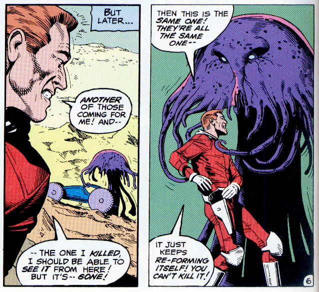
5. Ben Oda Oda’s clean and precise lettering style paved the way for Orzechowski’s almost too-perfect lettering style. Oda’s letters caught my eye because they were reminiscent tome of an English letterer called Bill Nuttall whose work was a major influence on me and who got me my first job.
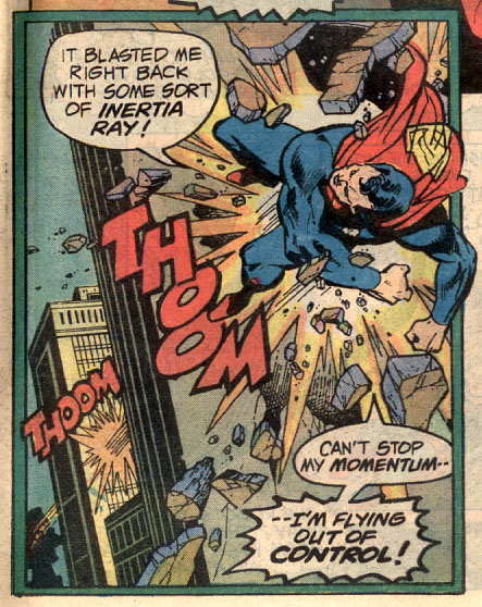
4. Gaspar Saladino The master and originator of the more elaborate DC style of lettering. I’m told that Gaspar had a stone on which he would grind down the nibs he used for lettering and so create the perfect point for his line. Todd Klein, Bill Oakley and others who seek to letter in his style have been described as “kissing the Gaspar Stone.”
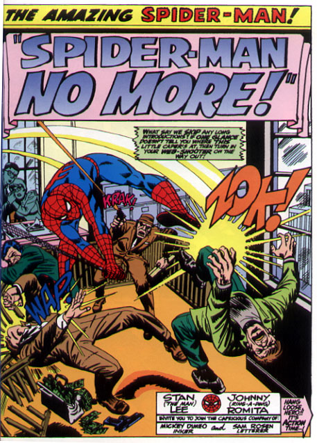
3. Sam Rosen His loose and easy display lettering style has been imitated by letterers ever since, but never equaled. Sam and Artie Simek created the Marvel lettering style which influenced everyone who followed in their footsteps, including Orzechowski, Rick Parker and myself.
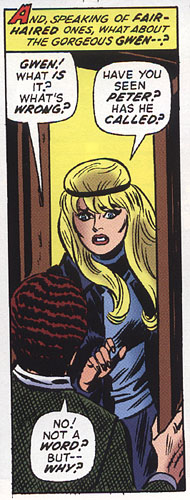
2. Artie Simek The first letterer I noticed using “drop caps” in caption boxes. Even though this caught my eye, his work was complementary to the art and never distracting.
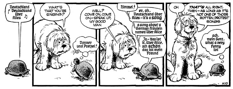
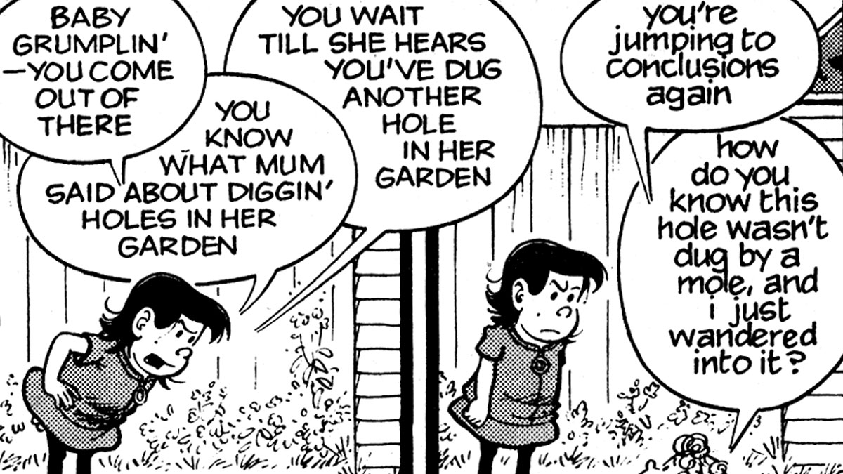
1. Dennis Collins The Silver Age letterer you’ve never heard of — Dennis Collins was, for twenty-six years, the cartoonist of the UK newspaper strip, THE PERISHERS, from the late fifties through the eighties. His crisp and clear lettering was full of character and innovation. More than anything else, it was Collins’ work that inspired me to pick up a pen and try my hand at cartooning and lettering.

