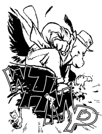
Ever wondered what to call those little lines of weathering on the bottom of Sound Effects? Now all you have to do is check The Comicraft Glossary of Lettering Terms — from Air to Zig-Zag Tail, they’re all here!
[A] [B] [C] [D] [E] [F] [G] [H] [I] [J] [L] [M] [N] [O] [P] [R] [S] [T] [W] [Z]
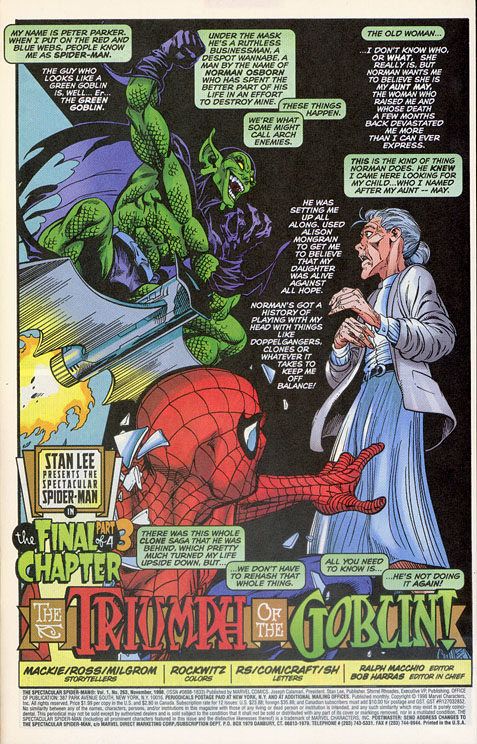
AIR – the amount of space between text in a word balloon or caption and the edge of the balloon or caption. About one letter width is a good rule of thumb. Letterer John Workman puts a lot of air as a stylistic choice. Too little air can result in Gridlock. (See Fig. 1 and Fig. 13)
BALLOON – circular shape used to contain speech — and “Air” — in a comic book. Sometimes referred to as “Bubble,” but not by us, we’re professionals.
BALLOON GUIDES – see “Placement.”
BORDER – the outline of each panel or frame.
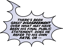
BURST – a jagged balloon shape used to indicate yelling or screaming.
BUTTING – connecting or masking a balloon to the edge of a panel border.
CAPTION – generally a rectangle-shaped box that contains voice-over first person or third person narration. Sometimes referred to as “Box.” Pah — amateurs. (See Fig. 2)
COMPUTER LETTERING – using fonts, illustration programs and computers to create lettering. Also known as “Digital Lettering.”
COUNTER – the enclosed space in letters such as A R B P e d q and so on.
CREDITS – the list of creators and their responsibilities in the creation of the comic book. Usually, but not always found on the title page — see “Title Lettering.” (See Fig. 7)
CROSSBAR “I” – is used for the pronoun “I”, as in “I’m”, “I’ll”, etc., and for the pronoun “I” only. The appeaance of a crossbar “I” in the middle of a word is an obvious sign of an amateur lettering job.
DEAD SPACE – the area in a panel that begs to be filled with captions and balloons.
DEFLATED – a wobbly-edged balloon used to suggest soft or “weak” speech. Usually has slightly smaller text inside. (See Fig. 3)
DISPLAY LETTERING – Sometimes known as “Title Lettering,” display lettering includes story title lettering but also covers SFX, Signage, Credits and any and all Calligraphy or Labels on cans or boxes or items in the artwork.
DOUBLE GUTTER BURST – Actually a single gutter balloon, this balloon is not really a burst but two balloons — one inside the other. This style is favored by some writers and letterers to indicate yelling, but not screaming.
DROP CAP – A CAPital letter that DROPs from the top line of a caption at least two or three lines to distinguish the first caption in a book — or scene. (See Fig. 2)
DROP SHADOW – A second rectangle-shaped box behind a caption — often colored — to specifically indicate first person narration.
ELBOW – balloon tail that bends in the middle like an elbow. Often used to cover long distances between the speaker and balloon, or to help indicate that the speaker is off-panel or around a corner. (See Fig. 4)
ELECTRONIC LETTERING COMPOSITION (E.L.C.) – the process of combining digital lettering with finished color artwork to produce files for printing.
ELECTRIC BALLOON – Also known as a “Radio Balloon,” the electric balloon is often used for radios, televisions, telephones or robots. They may vary in style but generally are represented by punk’d balloon shapes. (See Fig. 5)
FACE – typestyle, letterform or font.
FOOTNOTE CAPTION – the small caption at the bottom of a panel in which editor’s notes explain asterisked (*) items in the balloons or captions above.
FRAME – See “Panel.”
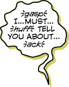
FIREFLIES – three little lines on either side of a non-word sound, such as “sigh” or “gasp”. Also known as “breath marks,” “roachlegs,” and in Portuguese, “bigodes de gato (cat mustache)” (See Fig. 3)
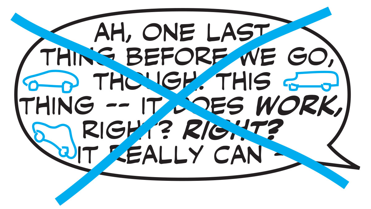
GRIDLOCK – letters too close to the balloon edges. (See Fig. 13)
GUTTER – The space between panels.
HAND LETTERING – using pens, pencils and brushes to create comic book lettering. More accurately described as “Pen Lettering.”
HYPHENATION – is to be a-voided when-ever poss-ible!
ICY BALLOON – A balloon that appears to have icicles hanging off it, used to imply that the speaker is pissed off!
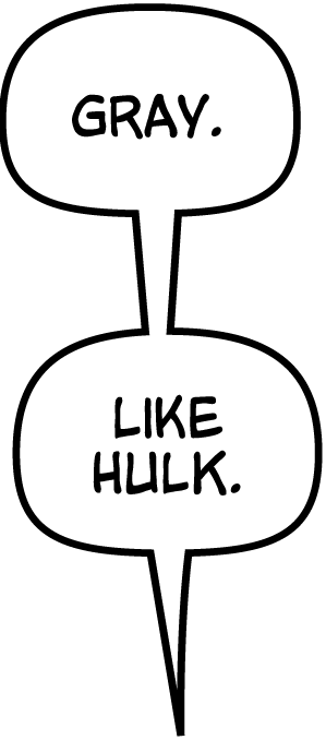
JOIN – tail that connects two balloons. Just like a tail, it should get smaller as it gets closer to the speaker. (See Fig. 6)
LIGHTNING TAIL – a balloon tail with sharp angles to indicate that the voice comes from an electrical device or robot. Sometimes used to indicate anger. (See Fig. 5)
LOAVES OF BREAD – a series of balloons that are almost square, and may be slightly narrower on the top and wider on the bottom. The balloon shapes vary from one balloon to the next. A signature feature of Joe Rosen’s lettering on many Marvel Comics, and the style of choice for artist Tim Sale. (See Fig. 6)
LOOSE LETTERING – loose lettering refers to caption — or sometimes balloon — lettering that has no box or balloon and appears to be floating “loose” in the panel. (See Fig. 7)
MANGA BURST – an erratically drawn burst balloon used not only to suggest yelling and screaming but also to indicate that the speaker’s eyes are popping out and his blood pressure is going off the scale.
MASK – to cut a balloon “behind” a figure or object so that the object comes forward. Be sure not to break the 3D Plane, though. (See Fig. 8 and Fig. 12)
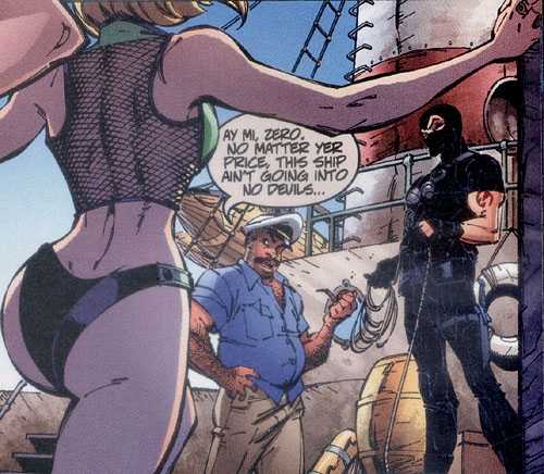
OBJECTIFY – to place a balloon or other lettering object in a way that causes it to be perceived as a physical object. (See Fig. 12)
ONOMATOPOIEA – See “SFX”
OPEN SFX – Sound Effects which are all outline and no fill — also referred to as “Hollow SFX” they allow the artwork inside the SFX to show through. (See Fig. 11)
PANEL – a frame of action on a comic book page. Also called “Frame,” natch’.
PARKING SPACES – empty space at the end of a line of dialogue inside a balloon that is shorter than either of the lines above it. If it’s big enough to park a car in, then find a way to get rid of it — preferably without Hyphenating. (See Fig. 13)
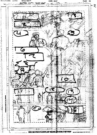
PLACEMENT – the art of positioning lettering and sound effects on the page in a way that leads the reader’s eyes from panel to panel, without covering any figures or important objects. Also known as “Balloon Guides.” (See Fig. 9)
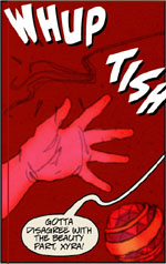
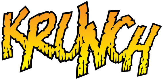
ROACH CHEW – dashed lines at the bottom of SFX or display lettering that indicate weathering. (See Fig. 10)
ROBOT BALLOON – a rectangle shape with sliced off corners and lightning tails most often used to indicate that the speaker is a robot.
RULE #1 – See Storytelling.
SAUSAGE – a balloon that is short and wide, resembling a sausage. Generally a sign of lazy Word Arrangement, though master letterers Tom Frame and Todd Klein somehow manage to use them successfully.
SCREAMER – An Exclamation Mark! Note that SFX are NOT exclamations and should not have exclamation marks, and that exclamations themselves only need one exclamation mark.
SKOOTCH – to move lettering elements such as balloons or SFX slightly.
SPECIAL BALLOON – a unique balloon shape, often used in conjunction with a unique font to indicate a particular voice, perhaps when a character is possessed or demonic or from another country, planet or dimension — or all the above!
SOUND EFFECT (SFX) – word used to indicate a sound occurring within the panel. (See Fig. 4 and Fig. 10)
STORYTELLING – the primary goal of the letterer is to best serve the story being told. Every decision should flow from there. See also Rule #1
STROKE – the thickness of the outline of a balloon or SFX.
TAIL – pointy part of the balloon that indicates who is speaking. Should point to the mouth (or whatever the source of the sound is), rather than just at the head or in the figure’s general direction. As a general rule, the tail should travel about half the distance to the speaker. Sometimes referred to as “Pointer.”
TANGENT – when the edge of a balloon or another piece of lettering coincides with a line of the artwork (or the panel border) it can Objectify the lettering in the reader’s mind. Something to watch for and avoid — usually a quick skootch will fix it.
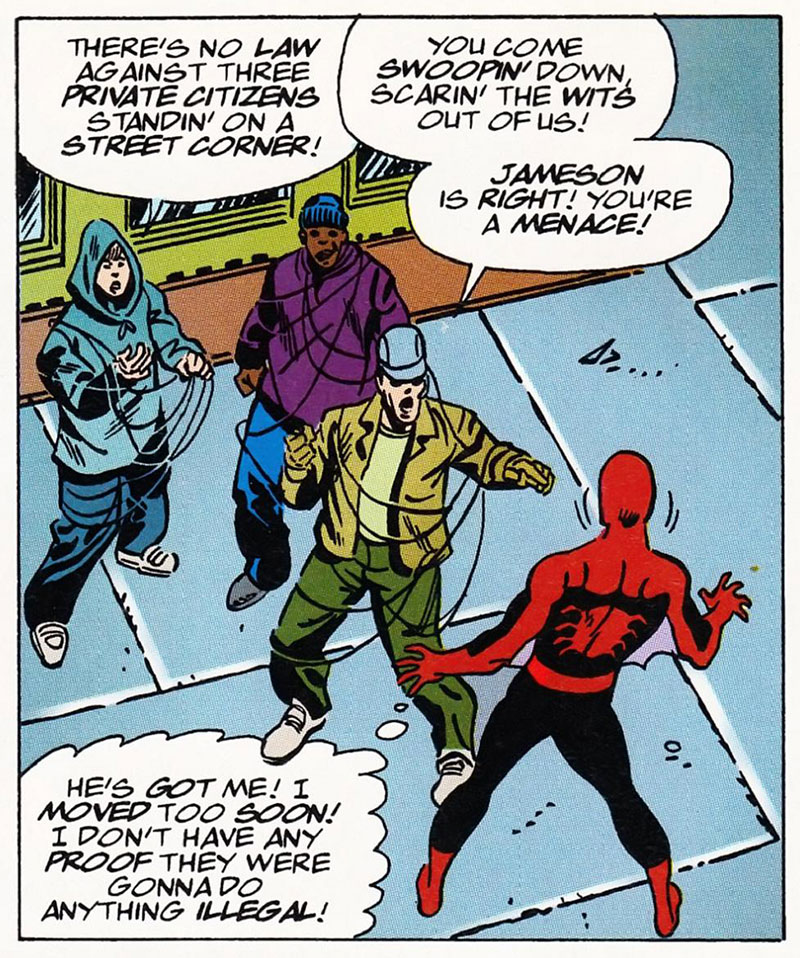
3-D PLANE, THE BREAKING OF – placing a lettering device in front of one object and behind another in a way that contradicts where the objects “exist” in space will also cause the lettering to become Objectified. To avoid this, imagine each balloon, caption and sound effect is on one or more vertical sheets of 2-D glass placed within the panel. (See Fig. 12)
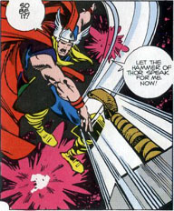
THOUGHT BALLOON – Indicated by a cloudy scalloped balloon shape and a series of three or four circles that point towards the thinker’s head, thought balloons have fallen out of favor in recent years but were once a staple device in mainstream comics. (See Fig. 12)
TITLE LETTERING – The lettering involved in the creation of the story title. Often used to describe “floating” captions such as “New York City” when the writer wants the caption to appear as it might on a TV show or in a movie. (See Fig. 7)
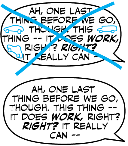
Fig. 13: Before: this ball
oon suffered from Gridlock, and bad Word Arrangement left too many Parking Spaces.
After: just the right amount of Air, and a Widow at the end makes for a pleasing TV Shaped word balloon.
TV SHAPE – a slightly squarish balloon, helpful for containing large chunks of dialogue. See also “Loaves of Bread.” (See Fig. 6 and Fig. 13)
WEAK – a small and erratic style of lettering, but not a whisper. Useful for the voices of injured and/or dying characters. See also “Deflated.” (See Fig. 3)
WHISPER – traditionally a dashed or broken balloon outline is used to indicate that the speaker is whispering. With the advent of computers, gray text and balloon edges are another option made popular by those awfully nice chaps at Comicraft!
WIDOW – the lone word at the beginning or end of a paragraph. In typography, these are heavily frowned upon — hence the expression “Kill the Widow” — but they’re quite welcome at the top or bottom of word balloons in comics. (See Fig. 13)
WORD ARRANGEMENT – organizing lines of dialogue to fit inside a word balloon. Good word arrangement results in a nice, round shape, while avoiding Parking Spaces and Hyphenation. (See Fig. 13)
ZIG-ZAG TAIL – a balloon tail with extremely sharp Elbows. Can be used to indicate loud speech and/or an electronic voice.
